Part 1: Insights from the Video on 12 Monkeys and La Jetée Key Takeaways: The video compares Chris Marker’s La Jetée (1962) and Terry Gilliam’s 12 Monkeys (1995), focusing on their storytelling methods and themes. Here are some main points: • Storytelling Methods: La Jetée uses a series of still photos to tell its story, giving it a unique and memorable feel. On the other hand, 12 Monkeys uses regular movie techniques, which allows for more action and character development. • Themes: Both films explore time travel, memory, and human experiences. They look at how time can be a repeating cycle and how people deal with their past and future, raising questions about fate and free will. • Visual Style: La Jetée has black-and-white images that create a stark and thought-provoking atmosphere. 12 Monkeys presents a gritty, dystopian world, adding depth to its story. Applying This to Your Short Film: Learning from these films can help in several ways: •...
1. What titles are displayed during the opening sequence? Titles that are displayed in the opening sequence would be the title of the movie,the actors that are going to portray in the move, the director of photography, the editor, who the makeup artist is, clothing maker, sound eroding by, art direction by, associate producer, the director and the writer. 2. What image are prioritized in the opening sequence? The images that were prioritized in the opening sequence were image of a maid , a priest, three men talking, a women who I am guessing is the main character because of how many shots of her are in the opening, two men struggling to put on a coat, then shots of a bride and groom rushing to their wedding. Based on from what I have seen I am guessing that the opening sequence is based off the struggles the man and the women are going through to get to their wedding in time. 3. How does the film establish a feelin...
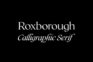
For the fonts we decided that we woul d use Roxborough Calligraphic Serif with a vibrant red color. The background would be black to show the contrast between the bright red and it attracts attention. Red is demanding and eye-catching. When it is displayed against a black screen attention will be called to the title, whic h will also bring up questions about the sequence. We decided that our title will be “The shifter” to represent the shift in beh avior that will be displayed in our opening sequence. The title will be displayed in big font and the rest of the title including the directors' names, the actors' names, the editors' names, and the names of the music artists will be displayed in smaller font. The people's name will be displayed in plain white in the Times New Roman font. The titles will be displayed on the screens by fading in and fading out. Each title will be on the screen for 3-6 seconds and then it will fade to the next title. It i...